Critique By Design
Part 1: Data Visualization with Reference Data
For this assignment, I chose the data visualization below from the article. The primary objective of this article is to convey through different data visualizations how the US-China trade war has impacted the health of both economies and brought fear to the global markets.
This data visualization reflects the Foreign Exchange Reserves of different countries for Q1, 2018. I chose this visualization because of three reasons:
- Foreign Exchange Reserves are regarded as the health meter of any country, and include assets such as foreign currencies, gold reserves, treasury bills etc. that are retained by the central bank or other federal monetary authority.
- The visualization does not support the main premise of the article since it does not provide any trends for comparison but only offers a snapshot view of this economic indicator for one quarter.
- The graphic does not follow principles of good design and has room for improvement across several elements, if evaluated on the heuristics model.
Reference data for foreign exchange reserves of different countries across several years was retrieved using the World Bank’s Data Repository.
Part 2: Critique the visualization
Describe your overall observations about the data visualization here. What stood out to you? What did you find worked really well? What didn’t? What, if anything, would you do differently?
Overall, I believe the visualization does a mediocre job at conveying the information in the context of the article which talks about the US-China trade war and its impact. The use of bold font to highlight the top three countries with biggest Forex Reserves caught my attention immediately. I could also easily identify how the colors corresponded to geographic regions, which aided comparison between these countries. Using the critique approach, I have tried to decompose the elements that worked well and those that didn’t in this question and the next.
Completeness: The visualization provides a snapshot view of Forex Reserves for different countries, but offers no meaningful information regarding historical trends of this economic indicator that could imply an impact of the US – China trade war, which is the main premise of the article. However, the use of a map seems to be a good choice in providing a high-level picture of countries with the biggest Forex Reserves.
Perceptibility: The varying size, positioning and styling of labels makes the graphic confusing to the human eye. The repetitive use of “$” and B i.e. billion in the labels appears to be redundant and adds to the text clutter. Comparison between countries needs a lot of eye travel and identifying the countries with the biggest Forex Reserves beyond the ones bolded is a cumbersome task. However, I like how perception is aided with the caption at the bottom left describing how the size of the country corresponds to its level of Forex Reserves.
Truthfulness: Since non-uniform shapes are used to reflect the magnitude of Forex Reserves, it is practically impossible for one shape to be exactly twice the size of another shape if its Forex Reserves are double. Moreover, some figures are reported to one decimal place while others appear to be rounded off, making one question the authenticity of this representation.
Aesthetics: There is no consistent alignment of the labels and the presence of a key in the middle of the map downplays aesthetics. The use of green for Europe inadvertently makes it look like the only region which is performing well on this metric. However, the use of black color for text on white background makes the graph look less distracting.
In terms of redesign, I would possibly use a standard world map with bubble size for each country reflecting the size of Forex Reserves. Built onto this, an animation to depict the change in these sizes over time could also provide a more informed perspective.
Who is the primary audience for this tool? Do you think this visualization is effective for reaching that audience? Why or why not?
I believe the primary audience for this visualization is university students/ professionals from the field of political science or general audience seeking a quick understanding of the global economic repercussions of deteriorating US-China relations. Based on my experience, economists usually rely on reports and tables instead of articles and graphs, which makes me rule this segment out of the intended audience. Moreover, since the article uses terminology from university level and beyond, the graphic can reasonably be thought to target individuals who possess a basic understanding of what economic indicators such as Forex Reserves mean.
For elements in the critique approach primarily associated with audience needs, I have evaluated the effectiveness of this visualization in reaching the intended audience.
Usefulness: Since Forex Reserves are a key indicator of a country’s health, it seems to be wise choice to represent this information to highlight a country’s economic performance. However, they do not provide a holistic picture, which makes this graphic limited in its usefulness. Moreover, the graph shows no information about exports which are mentioned in the article’s section header for this visualization. Keeping in mind the intended audience above, we can fairly assume the audience would be able associate larger Forex Reserves with better economic stability.
Intuitiveness: Despite the use of size being clearly described to reflect the magnitude of a country’s Forex Reserves, there is a violation of convention here since the audience would try to locate countries keeping in mind a standard map. The map doesn’t report countries with forex reserves below $5B so those geographies have been wiped out from the graphic, making navigation from one country to another more difficult. Moreover, the title is not accompanied with any caption and essentially reinforces the units of measurement in the key, which would make it difficult for the intended audience to draw an insight from this visual.
Engagement: The labels, captions, and footnotes distract the user from actively engaging with the data. However, the attempt to place labels close to the visual is an aspect that makes interpretation easier, thereby drawing engagement. Moreover, for someone in the audience only concerned with US-China comparison and not the global impact as a result of the trade war, the idea that China is leading in this economic indicator cannot go unnoticed when looking at this visualization.
Final thoughts: how successful what this method at evaluating the data visualization you selected? Are there measures you feel are missing or not being captured here? What would you change? Provide 1-2 recommendations (color, type of visualization, layout, etc.)
I think this method helps to objectively look at key expectations from a visualization. Moreover, the rating on each element instead of just two in the Good Charts Method allows a quantitative assessment of each visualization and unambiguous grounds for comparison. One element which is think is missing here is discussion on the first idea which forms when one looks at the visualization. This helps trigger thought before one elaborates further into the critique.
In terms of change, I would consider using another form of visualization such as line chart to depict trends over time, with additional features such as region selection or race to highlight a comparison of ranks in terms of Forex Reserves between the US and China. I would also ensure a uniform alignment of labels, addition of meaningful insight/captions and rethink portrayal of data for top performing countries within each region, while moving the rest to the background.
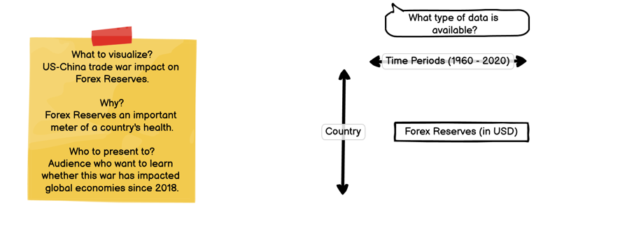
Part 3: Wireframe a Solution
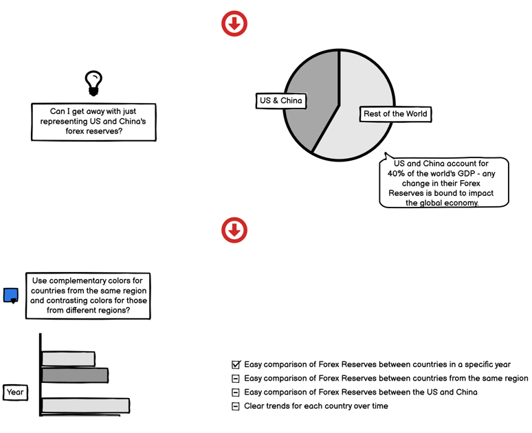
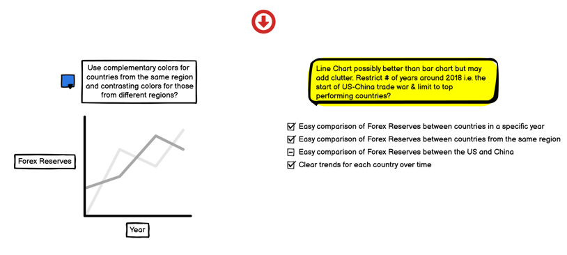
I tried using the tool Balsamiq to draft my thought process. Considering the type of data, I decided to use another visualization type to redesign the map above based on the issues identified in the critique method. I first considered using either a bar or a line chart below, but decided to sketch only the line chart due to the limitations identified with bar charts in representing this data, primarily the absence of historical trends.
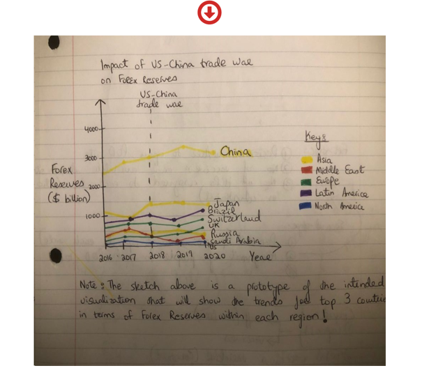
Part 4: Test the Solution
I showed the wireframe to two individuals: my spouse, considering her academic background in Political Science and another peer at Carnegie Mellon University. Responses from each individual are mentioned under the questions.
Can you tell me what you think this is?
- “A line chart depicting the FOREX reserves of major countries over a period of time.”
- “Change in Forex reserves over the years for different countries.”
Can you describe to me what this is telling you?
- “While drawing comparison between the countries that have the highest FOREX reserves in their regions, the graph highlights how much greater China’s reserves are compared to the rest of the world.”
- “Before and after-effects of US-China trade wars on Forex reserve.”
Is there anything you find surprising or confusing?
- “From 2019-2020, all countries seem to have either a relatively steady or increasing FOREX reserves. The United States’ reserves are much lower than those of China’s.”
- “Seeing same color for Japan and China got me confused. At first, I thought these are different colors and I am not looking at them properly but realized from the key that you have clubbed colors as per region.”
Who do you think is the intended audience for this?
- “The audience is most likely governments, or independent entities, such as the World Bank Group or International Monetary Fund, who could utilize this visualization.”
- “Those who have some knowledge of the war and how it can possibly affect forex rates so definitely an audience that has some background knowledge on international affairs and political economies.”
Is there anything you would change or do differently?
- “There seems to be a lot of clutter with the lines and labels on the graph. Perhaps this is a problem with the prototype and if drawn to scale with more space, it would be less of a strain for the audience to draw conclusions. If the top 3 countries are shown from each region of the world together, this type of visualization might fail to convey any insight.”
- “Introduce a print version (black and white version) for this graph. Colors can be deceiving in print versions (and even for audiences suffering with some form of color-blindness) so adding different symbols for each curve data point might be a better idea.”
Part 5: Build Your Solution
Written Summary
Stephen Few’s Critique Method allowed me to disassemble the visualization into crucial elements and examine each individually. Critique components such as truthfulness made me consider ways in which the original visualization type could be problematic in presenting this data accurately. Moreover, thinking about the audience helped me refine my perspective before approaching the redesign phase, as I could screen out unnecessary details from my rudimentary thoughts and instead look for completeness within the identified context. To summarize, the critique made me think about how to align my visualization with the audience expectations by incorporating more data such as year on year trends and filtering out trivial information while redesigning by narrowing down to top performing countries within each region.
The wireframes helped me map my thought process, understand the type of data available and evaluate the pros & cons of few visualization types. The user feedback based on the wireframe and redesign sketch allowed me to gain some confidence regarding my understanding of the intended audience. However, at the same time it showed me how the presence of clutter and disregard for the use of color blind safe palettes required rework. The feedback garnered made me feel like the key assigning same colors to each region had little contribution in aiding perceptibility, thereby challenging my original thoughts in the critique. The premise of the article revolved around the US-China trade war but it wasn’t quite evident to the users here, which made me want to reinforce this idea in my final visualization. Except the suggestion to change shapes, I tried to address these concerns in the graphic below.
For my final visualization below, I had to rework the data to show a line chart that could help identify trends over the years, 2011 to 2020. With a broad enough time horizon, the audience would be able to see whether Forex Reserves were in any way correlated with the US-China trade war. Instead of grouping countries based on regions, I decided to only show countries which had the highest Forex Reserves in their region (in addition to US and China). This was in line with insights from the critique and user feedback, aiming to make the graph look less busy, without compromising on its completeness. A red highlight on the x-axis helped me make the main event under question i.e. the US-China trade war more prominent, and the use of menu feature at the top made comparison between any pair of countries, for example, US and China clearer. The menu feature to select a subset of trend lines also helps adjust the y-axis scale, which is not user friendly when all the trend lines show at once. Finally, I used color blind safe palette for the lines and rephrased the title/ subtitle to support the premise of the article.
In my wireframe, I highlighted a limitation of bar charts: an absence of trends over time. However, I was able to explore this animated bar chart, which interestingly serves the purpose of easing comparison between countries and showing their progress over time. Although, I couldn’t highlight the US-China Trade War as an event here, I still thought it would be a good addition to this portfolio!