Visualizing Government Debt
Part 1: Working with web-based visualization tools and data
Bar Chart - European Union
The bar chart below depicts the gross debt of the general government as a percentage of GDP for the year 2019. The bars are arranged in an ascending order of this metric from left to right and each of the 23 countries in the data set is reflected by a separate bar. Overall, Estonia’s general government debt as a percentage of GDP is the lowest at 14%, whereas Greece has the highest general government debt as a percentage of GDP at 201%.
Part 2: Working with Flourish
Grid of Line Charts
The grid of line charts below shows how the Debt to GDP ratio varies from 1995 to 2019 for each country in the data set. The dashed vertical line marks the start of the recession in 2007, and intends to provide a comparison of this metric before and after this event.
Slope Chart
The slope chart below allows us to navigate through the transition of each country across four, consistently spaced time periods. I have highlighted here the country with the highest Debt to GDP ratio in 2019 within the sub-region it has been assigned to by the United Nations. The color scale has been modified using the Adobe Color tool so that colors such as green, which have an inherent meaning associated with them, could be removed. The color scheme is aligned with good design principles as lines for countries within the same region have complementary colors but are in contrast with countries from other regions.
It can be seen below that Greece seems to outperform other countries in Southern Europe. Similarly, USA, France, Great Britain, Hungary and Australia outran others in their respective regions. The slope chart also enables us to see and compare the ranks for these players between the starting and ending time periods for this data set:
| Country | 1995 Rank | 2019 Rank |
|---|---|---|
| Australia | 5 | 6 |
| France | 4 | 3 |
| Great Britain | 6 | 4 |
| Greece | 1 | 1 |
| Hungary | 3 | 5 |
| United States | 2 | 2 |
Comparing the Visualizations Above
The bar chart provides information regarding the Debt to GDP ratio for each country in a specific time period only i.e. 2019. It allows comparison across countries but does not provide information over the years. This restricts this visualization if one intends to see how a single country has performed on this metric over time.
In contrast, the grid of line charts is more space consuming, but visualizes two dimensional data by providing country and time specific analysis both. This also enables us to expand on the basic visualization and highlight major economic events on the graph to see if they had any impact on the Debt to GDP ratio. While this visualization is effective for displaying trends at a high level, it has a downside to it as well: unlike a bar chart, it does not provide an immediate cross country comparison, and figuring that out may require significant eye travel.
Finally, I chose slope chart as the third option since it trades off granularity for simplicity, but still manages to convey the key idea of how the Debt to GDP ratio has changed over the analyzed time period. The original data set from the OECD website had to be adjusted so that each country appeared only once in the first column and the Debt to GDP ratio for each year displayed in subsequent columns. Often known as the line chart’s fraternal twin, the slope chart displays exactly two points in time, which leaves an ascending or descending slope unnoticed.
Part 3: Working with Tableau
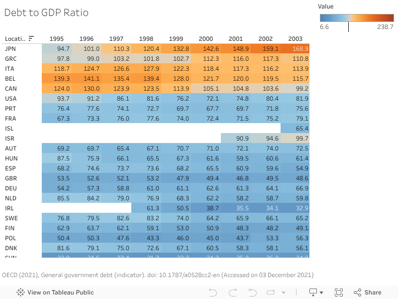
Highlight Tables
The graphic below was developed using Tableau. It visualizes the Debt to GDP ratio from 1995 to 2019 for 34 countries. The color scheme is defined to be orange for countries which have a ratio above 100, and blue for those with a ratio below 100.